This article is currently in the process of being translated into Korean (~20% done).
WPF TabControl: Styling the TabItems
이전의 글 중에 한 글에서 우리는 얼마나 이미지를 포함시키거나 텍스트의 색깔을 변경하는 WPF TabControl의 헤더들의 커스터마이징이 쉬운지를 발견하였습니다. 그러나, 만약 당신이 이것들을 뛰어 넘어 그 tab의 모습들에 더 직접적으로 모양, 테두리등을 포함한 모습들을 변경하고 싶다면 당신은 TabItem 요소의 control template을 상속하는 것이 필요합니다. 그리고 이것은 WPF의 다른 영역만큼 간단하지는 않지만 그래도 여전히 가능합니다.
So, if you would like to get full control of how the tabs of your TabControl looks, check out the next example:
<Window x:Class="WpfTutorialSamples.Misc_controls.StyledTabItemsSample"
        xmlns="http://schemas.microsoft.com/winfx/2006/xaml/presentation"
        xmlns:x="http://schemas.microsoft.com/winfx/2006/xaml"
        Title="StyledTabItemsSample" Height="150" Width="250">
    <Grid>
        <TabControl Margin="10" BorderThickness="0" Background="LightGray">
            <TabControl.Resources>
                <Style TargetType="TabItem">
                    <Setter Property="Template">
                        <Setter.Value>
                            <ControlTemplate TargetType="TabItem">
                                <Grid Name="Panel">
                                    <ContentPresenter x:Name="ContentSite"
                                        VerticalAlignment="Center"
                                        HorizontalAlignment="Center"
                                        ContentSource="Header"
                                        Margin="10,2"/>
                                </Grid>
                                <ControlTemplate.Triggers>
                                    <Trigger Property="IsSelected" Value="True">
                                        <Setter TargetName="Panel" Property="Background" Value="LightSkyBlue" />
                                    </Trigger>
                                    <Trigger Property="IsSelected" Value="False">
                                        <Setter TargetName="Panel" Property="Background" Value="White" />
                                    </Trigger>
                                </ControlTemplate.Triggers>
                            </ControlTemplate>
                        </Setter.Value>
                    </Setter>
                </Style>
            </TabControl.Resources>
            <TabItem Header="General">
                <Label Content="Content goes here..." />
            </TabItem>
            <TabItem Header="Security" />
            <TabItem Header="Details" />
        </TabControl>
    </Grid>
</Window>
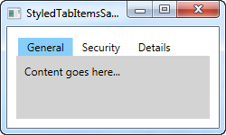
As you can see, this makes the TabControl looks a bit Windows 8'ish, with no borders and a less subtle color to mark the selected tab and no background for the unselected tabs. All of this is accomplished by changing the ControlTemplate, using a Style. By adding a ContentPresenter control, we specify where the content of the TabItem should be placed. We also have a couple of triggers, which controls the background color of the tabs based on the IsSelected property.
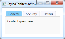
In case you want a less subtle look, it's as easy as changing the template. For instance, you might want a border, but with round corners and a gradient background - no problem! Check out this next example, where we accomplish just that:
<Window x:Class="WpfTutorialSamples.Misc_controls.StyledTabItemsWithBorderSample"
        xmlns="http://schemas.microsoft.com/winfx/2006/xaml/presentation"
        xmlns:x="http://schemas.microsoft.com/winfx/2006/xaml"
        Title="StyledTabItemsWithBorderSample" Height="150" Width="250">
    <Grid>
        <TabControl Margin="10" BorderBrush="Gainsboro">
            <TabControl.Resources>
                <Style TargetType="TabItem">
                    <Setter Property="Template">
                        <Setter.Value>
                            <ControlTemplate TargetType="TabItem">
                                <Border Name="Border" BorderThickness="1,1,1,0" BorderBrush="Gainsboro" CornerRadius="4,4,0,0" Margin="2,0">
                                    <ContentPresenter x:Name="ContentSite"
                                        VerticalAlignment="Center"
                                        HorizontalAlignment="Center"
                                        ContentSource="Header"
                                        Margin="10,2"/>
                                </Border>
                                <ControlTemplate.Triggers>
                                    <Trigger Property="IsSelected" Value="True">
                                        <Setter TargetName="Border" Property="Background" Value="LightSkyBlue" />
                                    </Trigger>
                                    <Trigger Property="IsSelected" Value="False">
                                        <Setter TargetName="Border" Property="Background" Value="GhostWhite" />
                                    </Trigger>
                                </ControlTemplate.Triggers>
                            </ControlTemplate>
                        </Setter.Value>
                    </Setter>
                </Style>
            </TabControl.Resources>
            <TabItem Header="General">
                <Label Content="Content goes here..." />
            </TabItem>
            <TabItem Header="Security" />
            <TabItem Header="Details" />
        </TabControl>
    </Grid>
</Window>
As you can see, I pretty much just added a Border control around the ContentPresenter to achieve this changed look. Hopefully this should demonstrate just how easy it is to get custom styled tabs and how many possibilities there are in this technique.